Support Vector Machine (SVM) is a supervised machine learning (ML) technique that is used for the classification as well as for regression. It works by finding the optimal hyperplane that best separates data points of different classes with the maximum margin.
It is mostly used for binary classification (where we have two classes) where we may need to detect an email is spam or not, a person has a disease or not, it will rain today or not etc. It also works well for higher dimensional spaces.
Key Concepts
- Hyperplane: A decision boundary that separates data points of different classes. In 2D, it’s a line; in 3D, it’s a plane; and in higher dimensions, it’s a hyperplane.
- Support Vectors: The data points closest to the hyperplane, which are critical in defining its position and orientation. These points lie on the margin boundaries.
- Margin: The distance between the hyperplane and the nearest data point from either class. SVM aims to maximize this margin to improve generalization and robustness.
- Hard Margin vs. Soft Margin:
- Hard Margin: Assumes data is perfectly separable with no misclassifications. Works only for linearly separable data.
- Soft Margin: Allows some misclassifications to handle noisy or non-linearly separable data by introducing a penalty parameter (C) for misclassified points.
- Kernel Trick: For non-linearly separable data, SVM maps the data to a higher-dimensional space using a kernel function (e.g., linear, polynomial, or radial basis function (RBF)) where a linear boundary can be found.
How does Support Vector Machine Algorithm Work?
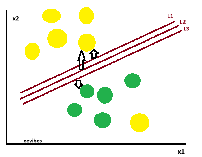
The core concept of the SVM algorithm is to identify the hyperplane that most effectively separates two classes by maximizing the margin between them. This margin represents the distance from the hyperplane to the closest data points, known as support vectors, on either side.
The optimal hyperplane—referred to as the “hard margin”—is the one that maximizes the distance between itself and the closest data points from both classes. This maximized margin ensures a clear and distinct separation between the two classes. In the illustration above, L2 is selected as the hard margin.
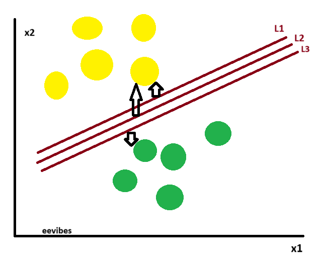
Now, let’s consider the following scenario:
Here we have one yellow ball in the boundary of green ball.
How SVM Classifies the Data ?
Support Vector Machine (SVM) classifies data by finding the optimal hyperplane that separates different classes in the feature space. Here’s a step-by-step breakdown of how it works:
Step 1: Input Data
You start with a labeled dataset:
-
Each data point
has a label
Step 2: Find the Hyperplane
SVM searches for a hyperplane:
that divides the classes and maximizes the margin, which is the distance to the closest data points from either class (the support vectors).
Step 3: Maximize the Margin
The objective is to:
subject to the constraint:
This ensures that all points are correctly classified and lie outside the margin.
Step 4: Classify New Data
Once the optimal hyperplane is found, SVM uses the equation:
-
If
→ Class +1
-
If
→ Class -1
This means a new data point is classified based on which side of the hyperplane it falls.
Example of How SVM Works?
Let’s walk through an example of using a Support Vector Machine (SVM) for a binary image classification task, such as distinguishing between images of cats and dogs.
Example: Classifying Cat vs. Dog Images
Step-by-Step Process
- Dataset:
- We have a dataset of 1000 images: 500 labeled as “cats” and 500 labeled as “dogs.”
- Each image is represented by features (e.g., pixel intensities, color histograms, or features extracted from a pre-trained convolutional neural network like VGG16 or ResNet).
- For simplicity, let’s assume we extract two features per image (e.g., average brightness and texture complexity) to visualize the data in 2D. In practice, images have high-dimensional feature vectors (e.g., 1000+ features).
- Preprocessing:
- Resize images to a consistent size (e.g., 64×64 pixels).
- Extract features using a method like Histogram of Oriented Gradients (HOG) or a pre-trained neural network.
- Normalize the features to ensure they’re on the same scale (e.g., mean=0, variance=1), as SVM is sensitive to feature scales.
- SVM Training:
- Goal: Find a hyperplane that best separates cat images from dog images based on their features.
- Kernel Choice: If the data is not linearly separable in 2D, use a kernel like the Radial Basis Function (RBF) to map the data to a higher-dimensional space where a linear boundary exists.
- Parameters: Tune the regularization parameter C (controls trade-off between margin size and misclassification) and the kernel parameter gamma (controls the shape of the decision boundary in RBF).
- Use a library like scikit-learn to train the SVM model.
-
- Prediction:
- For a new image, extract its features, feed them into the trained SVM model, and predict whether it’s a cat or dog based on which side of the hyperplane the features fall.
Simplified 2D Example for Visualization
To make the concept clearer, let’s assume we reduce the feature space to two dimensions (e.g., brightness and texture) for visualization purposes:
- Brightness: Average pixel intensity of the image (0 to 255).
- Texture: A measure of edge variation (e.g., computed using HOG or Sobel filters).
- Each image is a point in this 2D space, labeled as either “cat” (class +1) or “dog” (class -1).
- Prediction:
-
Suppose our data looks like this:
- Cats tend to have lower brightness and smoother textures.
- Dogs tend to have higher brightness and rougher textures. However, there’s some overlap, so the classes are not perfectly separable.
The SVM algorithm:
- Finds the optimal hyperplane (a line in 2D) that maximizes the margin between the nearest points (support vectors) of the two classes.
- If the data is non-linearly separable, the RBF kernel transforms the data to a higher-dimensional space, allowing a linear boundary to separate the classes.
I’ll use a scatter plot to represent the data points and approximate the decision boundary for clarity. The chart will be generated using a Chart.js configuration, as per the guidelines, with a scatter type to display the data points. For simplicity, I’ll assume a linear SVM for the decision boundary in this 2D example, though in practice, an RBF kernel might be used for non-linear data.
Chart Description
- Type: Scatter plot.
- X-axis: Normalized brightness (0 to 1).
- Y-axis: Normalized texture complexity (0 to 1).
- Data Points:
- Blue dots (#1E90FF) for cat images.
- Red dots (#FF4500) for dog images.
- Support Vectors: Highlighted with larger, outlined markers (same colors).
- Decision Boundary: A black line (#000000) representing the SVM’s separating hyperplane (linear for simplicity).
- Margin: Not explicitly drawn but implied by the distance between the decision boundary and support vectors.
Simulated Data
To create the chart, I’ll simulate 20 data points (10 cats, 10 dogs) in 2D space:
- Cats: Clustered around lower brightness (0.1–0.4) and lower texture (0.1–0.4).
-
Dogs: Clustered around higher brightness (0.6–0.9) and higher texture (0.6–0.9).
-
Support Vectors: A few points near the decision boundary (e.g., at the edges of each cluster).
-
Decision Boundary: Approximated as a line, e.g., y=-x+1
Chart Code
Below is the Chart.js configuration for the scatter plot. The decision boundary is approximated as a line by adding a dataset with two points to draw a straight line across the plot. Support vectors are highlighted by using larger point radii.
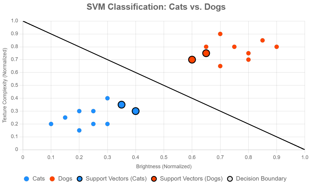
Explanation of the Chart
- Data Points: The “Cats” and “Dogs” datasets show 10 points each, clustered in their respective regions (cats in lower-left, dogs in upper-right).
- Support Vectors: Four points (two per class) are highlighted with larger radii and black borders to represent the support vectors, which are the closest points to the decision boundary.
- Decision Boundary: A black line from (0, 1) to (1, 0) approximates a linear SVM’s hyperplane. In a real SVM with an RBF kernel, this might be a curve, but a line is used here for simplicity.
- Colors: Blue (#1E90FF) for cats and red (#FF4500) for dogs ensure visibility on both light and dark themes. The black decision boundary (#000000) is distinct.
- Axes: Labeled as “Brightness (Normalized)” and “Texture Complexity (Normalized)” to reflect the features.
How This Relates to the Example
This chart visualizes the simplified 2D case from the cat vs. dog classification example. In a real-world scenario:
- Images would have many more features (e.g., 1000+ from a CNN), making the hyperplane high-dimensional.
- An RBF kernel would create a non-linear boundary, but the principle of maximizing the margin between support vectors remains the same.
- The support vectors determine the position of the decision boundary, ensuring robustness.
- The decision boundary here is a straight line for simplicity. If you’d prefer a non-linear boundary (e.g., for an RBF kernel), I can adjust the chart to approximate a curve by adding more points to the boundary dataset.
- For real image data, you’d preprocess images (e.g., extract features using a CNN) and train an SVM as shown in the Python code from the previous response.